


When you’re designing and picking out fabrics for your quilt online or at your local quilt shop, sometimes it’s difficult to settle on the colors you want to use. Some people have a natural intuition for which colors look right together and which ones don’t. For others, it might as well be a foreign language.
If you’re one of those who doesn’t quite have that instinct and you’re looking to step up your color palette game, or you have the instinct but want to know why certain colors fit together, you’re going to want to learn about color theory.
What is color theory?
Basically, color theory is the combined art and science of using color. It takes the science and psychology behind how we perceive color, and uses that information to determine which colors mix well together and which don’t. It even delves into the different moods certain colors unconsciously evoke in us (there’s a reason we use the phrase “seeing red” to mean angry!).
Color theory actually gets pretty in depth, and there are even certain people whose jobs depend heavily on it, like graphic designers and marketers. Of course, we’re only looking to learn how to make a quilt extra pretty, so we’re just going to cover the basics here.
The Color Wheel
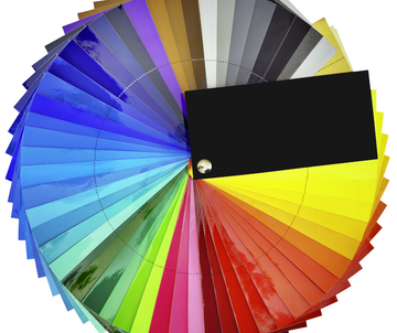
If you ever took an art class in school, chances are you’ve seen a color wheel. There are lots of more detailed variations, but most frequently, it’s the colors of the rainbow arranged in a circle from red to purple, with a few shades in between the colors.
The color wheel was first developed in 1666 by Isaac Newton (is there anything he didn’t do?) and has been adapted and used ever since to visually represent the relationships between the colors.
Usually, when we’re talking about the color wheel, we’re focusing on three types of colors:
-
Primary Colors - Red, yellow, and blue. These are the colors that can’t be created by mixing any combination of other colors together. All other colors are made up of these three.
-
Secondary Colors - Orange, green, and purple (or violet). These are the colors made by mixing the primary colors. On the wheel, these appear between the two colors they’re made up of (e.g. purple is between blue and red).
-
Tertiary Colors - Yellow-orange, red-orange, red-purple, blue-purple, blue-green, and yellow-green. These are the colors made by mixing a primary and secondary color together, hence their hyphenated names.
There are also the neutral colors (black, gray, and white), which are used to create different shades of the colors.
We’ll explain in a bit how to use the wheel to determine which colors go together, but first, let’s talk a bit about the individual colors and their effects, which can help you decide what types of colors you might want to look at for your quilt.
Color Psychology
We’re not always consciously aware of it, but colors and emotions are actually very closely linked. Through a combination of biological instinct and social conditioning, we tend to associate certain colors with certain feelings. Some of these vary based on the shade, but in general, these are the emotional associations we tend to make.
Warm Colors

Red, orange, and yellow are the three warm colors. When warm colors are more muted, they tend to evoke feelings of optimism and energy. We might associate them with autumn, and the comfort and activities of that season.
On the other hand, when warm colors are more vibrant, they tend to grab our attention and often signal danger. That’s why we use bright red for stop signs and yellow for caution tape.
Below, we’ll go into some more depth about the effects of each of the warm colors.
Red
Red is generally considered the most passionate color. It’s associated with war and anger, but also with love and desire (like a red rose). When mixed with white to make pink, it evokes more of a gentle and flirty feeling of love.
It’s the most attention-grabbing color, and has actually been shown to increase appetites and raise blood pressure. Keeping this in mind, red tends to do best in a quilt when it’s muted or used as an accent color.
Orange
Orange is most often associated with feeling enthusiastic, energized, and creative. It draws attention like red, but comes off as less aggressive and overpowering.
A bright orange can sometimes evoke a similar alarm feeling like red, but a more subtle orange is associated with things like sunsets and feelings of warmth.
Yellow
Yellow is the happy color. More than anything else, it’s associated with feelings of joy and optimism, like sunshine. That’s why the stereotypical smiley face design is colored yellow!
Although it’s a happy color, it’s another attention-grabber, and can be overwhelming if too much of it is used. Like red, it’s best as more of an accent color.
Cool Colors
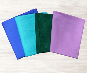
Green, blue, and purple are the three cool colors. These colors are generally considered more soothing, and evoke feelings of calmness and tranquility. Interestingly, cool colors can also make a space feel larger, which may be something to consider if you want to hang your quilt on a wall.
In certain contexts, cool colors are also associated with sadness, like Picasso’s famous “Blue Period”. That tends to depend on who you ask and often applies more to paintings. In something like a quilt, which usually doesn’t have any sort of narrative like a painting would, cool colors are less likely to come across as sad.
Below, we’ll go into the details of the three cool colors and their individual effects.
Green
Despite the common saying “green with envy”, green is almost entirely associated with positivity. As the color of nature, it’s often used to symbolize growth and prosperity, and leaves the viewer with a refreshed and optimistic feeling.
A bright lime green might be overwhelming in excess, but in general green is one of the easiest colors on the eyes, and you can worry less about moderation. If you want to make a quilt all in shades of green, go for it. You have the green light to go ahead!
Blue
Although it’s sometimes associated with sadness, without context blue is most often a calming and peaceful color, associated with trust and spirituality. The body actually produces chemicals that make you feel calm when you look at the color blue!
This is why social networks like Facebook and Twitter use blue for their websites. It’s relaxing and friendly, and easy on the eyes even when you’re scrolling for hours. Blue is good as an accent or a main color, so use as much or as little as you want in your quilt.
Purple
Purple is associated with mystery, creativity, and magic. It’s also considered the color of royalty and power, because in the old days it was a difficult color to come by, and could only be afforded by the upper class. In fact, some leaders even forbade anyone but the royal families from wearing purple at all!
A lighter shade of purple tends to be relaxing and calming, while deeper shades are perceived as rich and luxurious. Purple can be both quirky and dignified. Like the other cool colors, purple is generally not overwhelming and can be used as either an accent color or the main focus.
Color Schemes
Now that you have an idea of what the different colors tend to mean and which you might want to focus on, we can look at different sorts of color schemes and how to select them. If you’re considering doing some decorating around the house, these are also fantastic ideas to keep in mind. Color schemes are everywhere.
No color scheme is better than any other, it’s all up to you and your preference for what you think looks best. That being said, let’s get into some of the most common schemes.
Monochromatic Colors
A monochromatic color scheme is one that uses only one color. Instead, the patterns and depth come from combining different shades of that color. A black, gray, and white quilt, for example, would be monochromatic. You can also create interesting patterns and effects by using different types of fabric and patterns, but all in the same color.
You can choose any color for your monochromatic quilt, whatever best suits you and your project. You can even pick a warm color like red, just include lighter reds too so it’s not overwhelming.
Warm and Cool Colors
You could choose a color scheme for your quilt by making use of the effects of warm and cool colors. For a warm and inviting autumn-themed quilt, choose warm colored fabrics (red, orange, and yellow). For a quilt with a calm, wintery feel to it, choose cool colored fabrics (green, blue, and purple).
You can also choose to combine warm and cool colors to create interesting visual effects. Warm colors tend to instantly draw attention and appear to come right to the front of your design. These are also called “active colors”. Cool colors retreat into the back, and are called “passive colors”. For example, a quilt with warm colored flowers and a cool colored background will really make the flowers pop.
Neutral Colors
Neutrals are colors like black, cream, and brown. They’re all colors found in nature, and all are generally very calm and aren’t overwhelming to the eye. Neutral colors are passive, meaning they don’t fight for attention with other colors, which is why they’re so great as accents.
You could make a quilt using all neutral colors, which would have a calm, muted, and earthy feel to it. You could also make use of the neutral colors as background to colors you want to stand out.
Light and Dark Colors
Combining light and dark colors in a quilt is all about using the shapes and patterns to emphasize contrast between your selected colors. Similar to combining warm and cool colors, this allows your colors to pop or fade into the background as you wish.
You could go with a monochromatic quilt using this scheme, like a quilt in all black and white. You can choose colors that complement each other and play with the different shades, like a deep purple and a light yellow. For a more subtle contrast, you can also create gradients from light to dark with your colors.
Analogous Colors
These are colors that are right next to each other on the color wheel, like purple and red or yellow and green. Analogous patterns are frequently found in nature, like a spectacular purple, red, and orange sunset. Because of this, they automatically look harmonious together.
Typically, a traditional analogous color scheme is made up of one dominant color and two supporting colors. That tends to be more of a rule for graphic designers or interior decorators though, so no need to worry about sticking to that if you don’t want to.
Complementary Colors
Complementary colors are colors that are opposite of each other on the color wheel. The most basic combinations are red and green, blue and orange, and yellow and purple, but you can go further into secondary and tertiary colors too. All you need to do is look at a color wheel, find your first color, and draw a straight line across to find its complement.
A scheme using complementary colors is another great one if you’re looking for contrast. It’s usually a combination of a warm and cool color, so one will stand out, but because they’re complementary, the two colors naturally look good alongside each other, so no clashing. You can also apply the light and dark scheme by choosing a light version of a color and a dark version of its complement, like a Christmas quilt with dark green and pastel red.
Triadic Colors
A triadic color scheme is made up of three colors that are evenly spaced around the color wheel. If you drew lines to connect them, you’d have a triangle with three equal sides.
The most basic triadic color groupings are the three primary colors (red, yellow, blue) and the three secondary colors (orange, green, purple). You can also go into the tertiary colors and find your triad of colors there. Within your triad, you can play with the different shades of each color, like an Easter quilt with pastel orange, green, and purple.
Traditional
The most standard color scheme for quilting is made up of three colors: one dominant color, one supporting color, and one accent color. The dominant color is the one used the most, sometimes as a background. The supporting color is used often, but not as much as the dominant color, and is one that looks good and works well with the dominant color. The accent color is used the least, and adds an extra pop to break up the other two colors.
To design a quilt with a traditional scheme, a good trick to know is the 60-30-10 rule. This is used in all sorts of design, from flower arrangements, to interior decorating, to company logos. 60, 30, and 10 refer to the percentage of each color being used. Your dominant color should make up roughly 60% of the quilt, your supporting color 30%, and your accent 10%. You can pick any three colors you like, maybe using analogous or triadic colors as a guide.
Rainbow
As you may have guessed, a rainbow color scheme is one that uses all colors of the rainbow. This must include the three primary and three secondary colors on the color wheel. You can choose whether or not to include the triadic colors. Many people only include indigo (blue-purple) and leave the others out.
You can choose what to do with your rainbow. Play up the contrast between warm and cool colors, use different shades of each color, or use triadic colors to make a rainbow gradient. Using the rainbow is great if you’re looking for a vibrant, playful quilt.
Conclusion
At the end of the day, it’s your life and your quilt. You’re not trying to get your Masters degree in quilting design, so whether or not you choose to follow any of these “rules” is up to you. They’re all just guidelines.
The most important thing, above all else, is to pick the colors that you like, or that the recipient likes. When shopping online at Stitchin' Heaven you can search for your fabrics by color. If your grandkid wants a quilt in nothing but bright blue and red, then give them that, regardless of their color wheel position. It’s all about doing what makes you happy.

